drawer_rail
Reusable open-source Flutter component: collapsible, themeable navigation drawer/rail with search, sections, badges, expandable groups and flyouts.
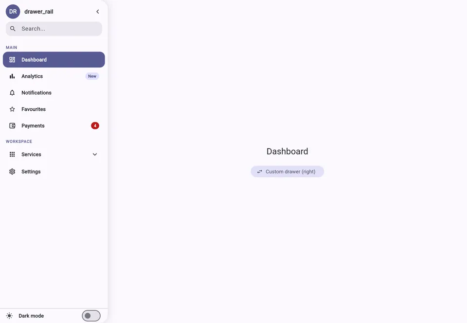
// Overview
A side navigation menu for Flutter with two states: an expanded panel, with search, sections, badges and inline-expanding groups, and a narrow icon rail, where groups become flyout menus.
// The challenge
Material's NavigationDrawer and NavigationRail are two different widgets — switching between them is left to each app — and neither brings search, nested groups or hover-to-open on desktop. Every app ends up rewriting its own side menu.
// Engineering decisions
Zero dependencies
- Choice
- state lives in a plain ChangeNotifier, with no state-management package.
- Why
- the component drops into any app without bringing a dependency along.
- Trade-off
- no ready-made Riverpod or BLoC integration — the app wires the state.
// The solution
A single declarative widget (DrawerSection, DrawerLink, DrawerGroup) with state in a plain ChangeNotifier, with no state-management dependency. Diacritic-insensitive search ("acao" matches "Ação") that also finds groups by name, hover-to-open on web/desktop without overwriting persisted state, correct cursors, theming derived from the ColorScheme with fallbacks, every duration and curve exposed, and the OS "reduce motion" setting honoured automatically.
My role
Author and maintainer — API, implementation, 52 widget tests, example app, CI and release pipeline, published on pub.dev under the verified publisher devfrs.com.
Tech stack
// Screens

// Outcome and evidence
Version 0.5 on pub.dev with a perfect score (160/160), WASM-ready, and in use in my own apps.
- widget tests
- 52